Evaluating Cultural Diplomacy projects with Neo4j
I will once again work with the small dataset I used for my previous post. However, this time I will not use Calc or Excel, but a graph database. Of course, for this tiny dataset, using this tool could be considered overkill. However, as I plan to add more projects and countries to the analysis in future posts, the advantages of a graph-based database will become obvious. Since it is well suited for analysing networks, it will allow us, in future iterations of this project, to analyse cultural relations by examining them as a network.
For now, I will partially repeat the same analysis as in my previous post, but I will also add some new analyses that are not easily possible with a tabular spreadsheet. For more info on the data, see evaluating_cultural_diplomacy_made_easy
Beyond that, I find graph databases more intuitive than relational databases. In cultural diplomacy, missions and their teams either manage cultural projects directly (engaging artists directly) or collaborate with external partners. This is far easier to visualise as a network than as a table of columns and rows.
Graph databases are built on the idea that things in real life are connected to each other. These things are called nodes, and they can have relationships. Graph databases are highly flexible and easy to work with, supporting a wide range of data types. For example, Wikipedia is based on a graph database. For my project, I’ll be using Neo4j, one of the market leaders in this space. Its query language is called Cypher, and Neo4j offers excellent learning resources on its website, making it quick to pick up. I use both their Community Server Edition, which runs locally on my system, and their cloud solution, Aura, which adds useful tools like Bloom for exploration and dashboards. Of course, if you’re working with sensitive data, it’s best to avoid using a corporate cloud solution. Since I’m using fake data for this project, there’s no issue.
Let’s start by considering how to manage our data and constructing a simple data model. Conceptually, I find the Theory of Change useful—it analyses how policy implementation can achieve meaningful impact. Using this framework, we can:
- Identify a challenge to address,
- Deploy specific instruments,
- Generate results,
- Analyse the outcomes, and
- Measure how these contribute to broader policy goals.
The Theory of Change helps structure the thought process into a model that supports cultural diplomacy, focusing on instruments most likely to generate positive outcomes. You can read more about it on Wikipedia Theory of Change
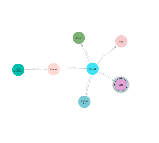
For this use case, I opted for the following data model. In Cypher a datamodel can be called with the following query:
CALL db.schema.visualization()
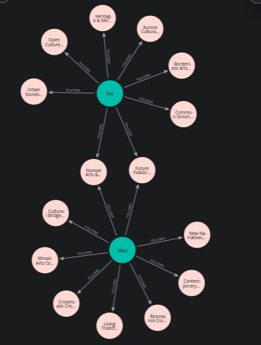
One feature I particularly appreciate is the ability to generate a graph visualisation of team members and their partners. While this is a small example, it effectively illustrates the team’s dynamics: who is working on what, and what the team is collectively focused on. For this example, I’ve included two team members, Eve and Mike, along with their local cultural partners.
There are different ways of constructing queries. Getting the graph can be done as follows:
MATCH p=()-[:FOLLOWS]->() RETURN p;
or
(t:TeamMember)-[f:FOLLOWS]->(p:Partner) RETURN t,f,p;
Which returns:
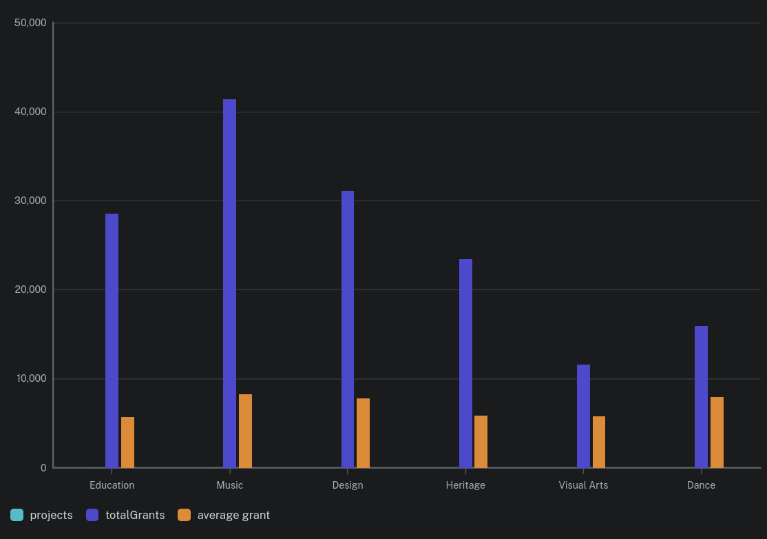
As in my previous post, Neo4j allows you to calculate average, maximum, and minimum grant amounts. Using its built-in dashboard functionality, you can easily generate visualisations, such as a bar graph showing the total and average grants awarded to different cultural disciplines.
MATCH (p:Project)-[:HAS_DISCIPLINE]->(d:Discipline)
RETURN d.name AS discipline, COUNT(p.naam) AS projects, SUM(p.grant) AS totalGrants, SUM(p.grant)/COUNT(p.naam) AS `average grant`
ORDER BY projects DESC;
Neo4j Aura generates an interactive graph that allows the user to indicate what variables to include.
Finally, Cypher queries can be integrated into a Jupyter notebook. This combination is very powerful, merging the flexibility of a graph database with the robust data analysis and visualisation tools offered by Pandas. In a future update, I’ll share examples of how this approach can enhance the analysis of cultural diplomacy projects. Before that, I will write a post in which I will illustrate setting up the graph database combining this small dateset and Neo4j.